TeleClinic
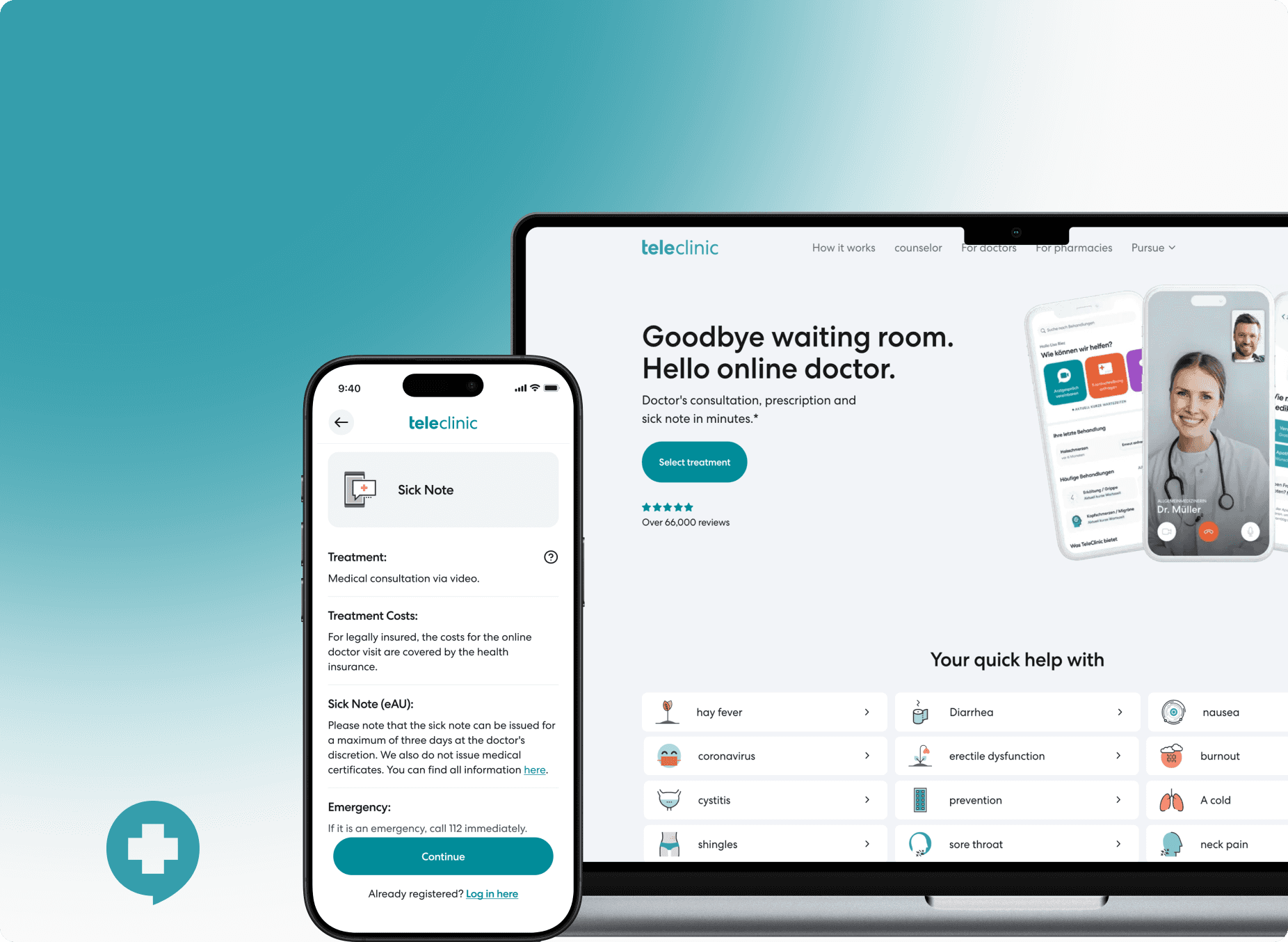
TeleClinic is a Germany-based digital healthcare platform that enables patients to access medical consultations online. It connects users with licensed doctors through secure video calls, allowing for fast, convenient, and compliant medical advice, prescriptions, and follow-ups — all without visiting a physical clinic.
As a leading telehealth provider in Germany, TeleClinic serves both insured and private patients, streamlining access to care across a range of medical concerns.
Team members on this project:
🧑🏻💻 Isabell Herzog - Senior Growth Product Designer
👨🏻💻 Neer - Product & Growth
Context
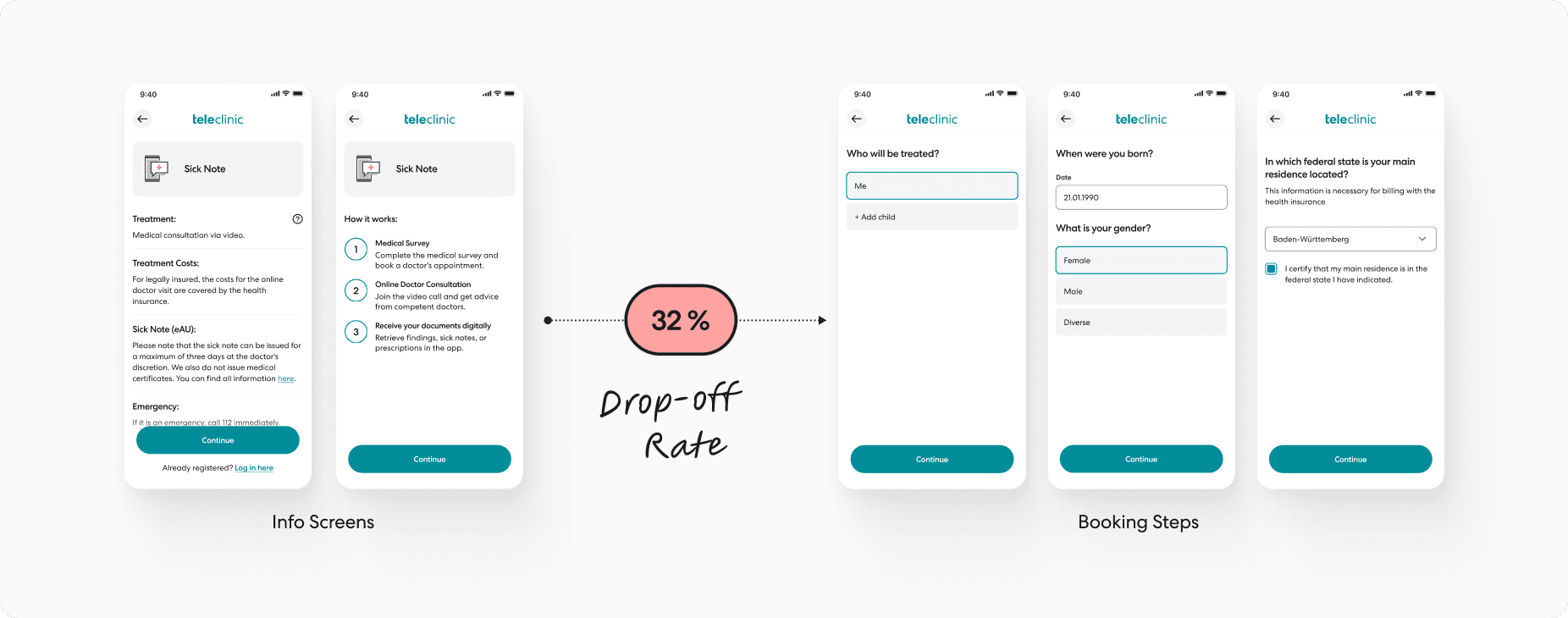
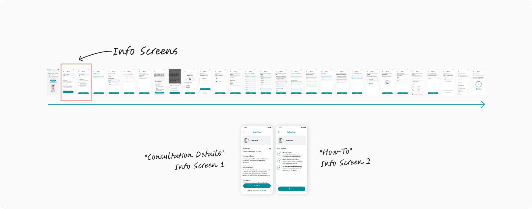
TeleClinic’s website acts as the primary entry point for new patients seeking online consultations. However, internal data revealed a 32% drop-off at the Info Screen stage — a critical point early in the booking flow.
This friction not only resulted in missed opportunities to convert high-intent users but also negatively impacted patient retention and care delivery.
Research Goals
Understand what's causing friction at the Info Screen step
Identify why high-intent users abandon early
Propose design and UX solutions to reduce drop-off and improve clarity
📌 Focus Segment: New users arriving via the website app who abandoned at the Info Screen
🎯 Primary Hypothesis: A combination of content clarity, design decisions, and process expectations could be contributing to the friction
Strategic Approach
We structured the work in 3 clear phases:
Phases | Focus |
|---|---|
Internal Alignment | Funnel analysis, stakeholder interviews, and data validation with the product team |
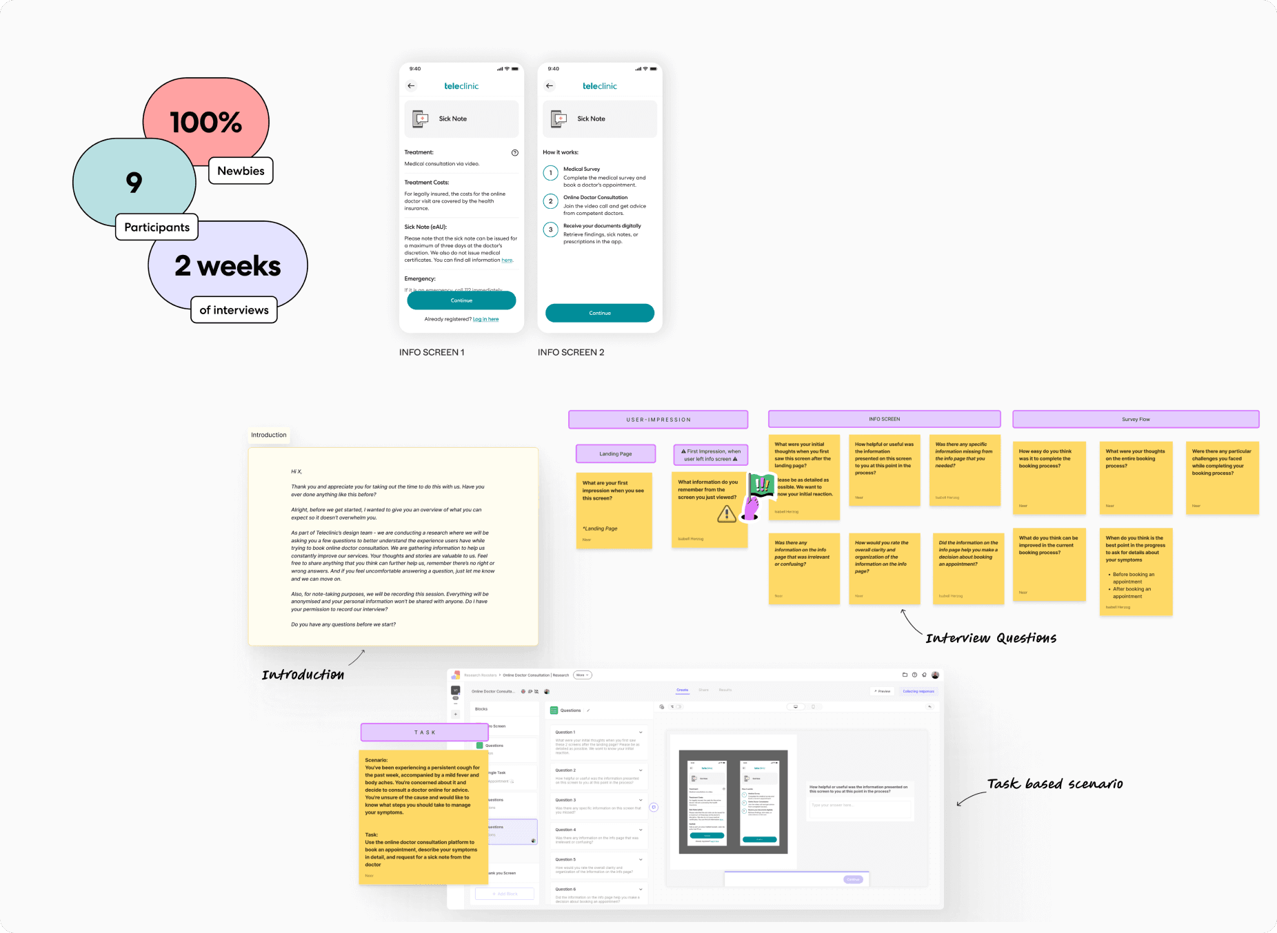
Mixed-Method Research | Usability tests, user interviews (9 participants, 28–38 y/o, Germany), flow analysis |
Insight Synthesis & Direction | Thematic analysis, mapping quotes to pain points, and consequence mapping |
💡 Initially planned segmentation for new vs. existing users was dropped due to technical feasibility. We focused exclusively on new users to stay within the timeline and scope.
Internal Alignment
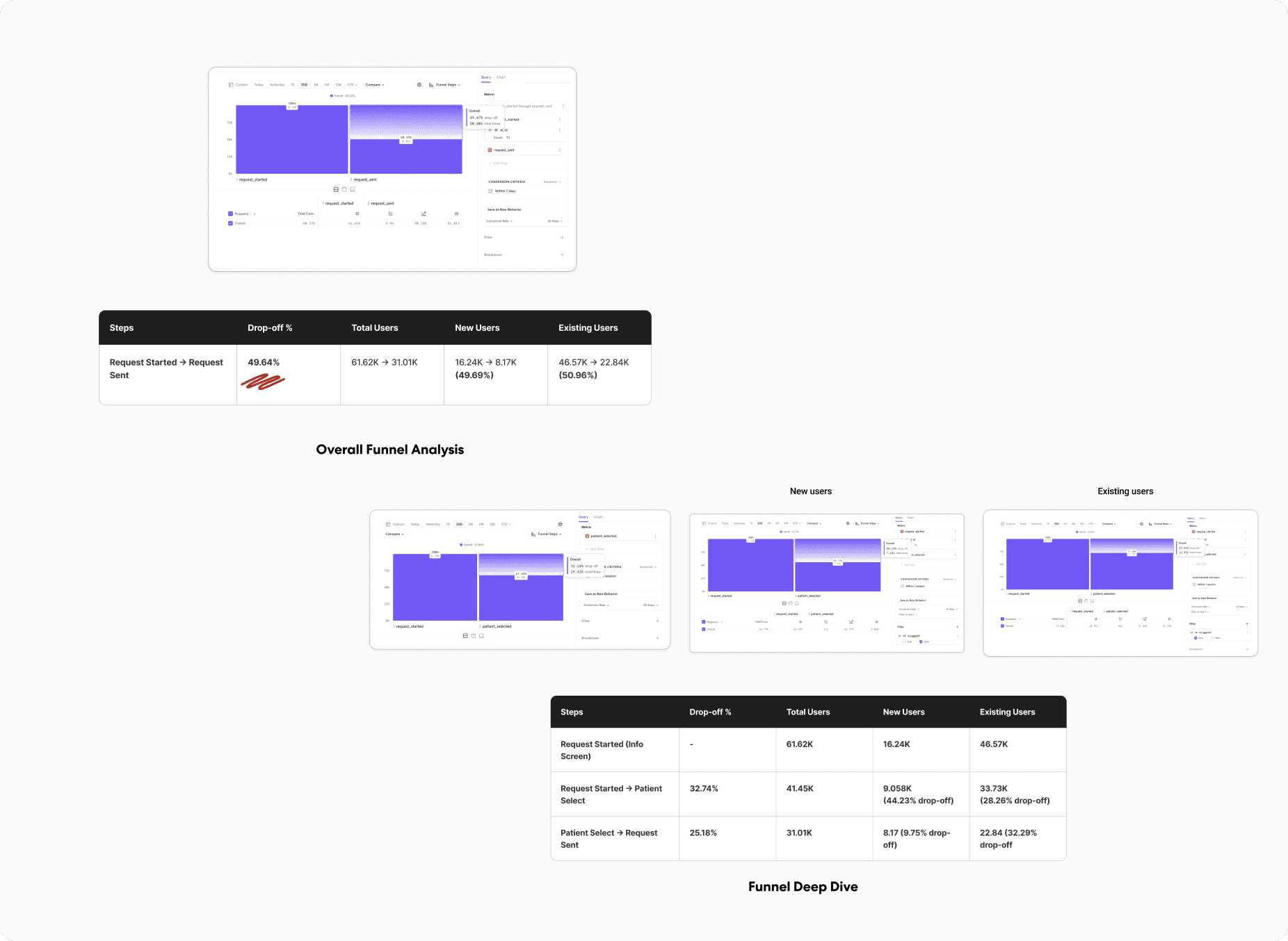
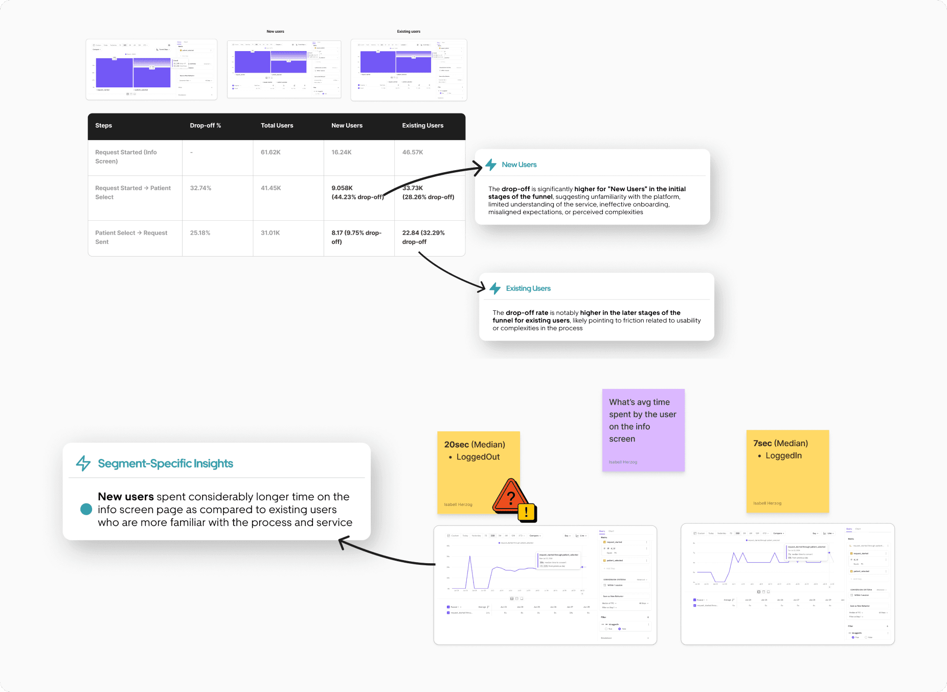
Reviewed funnel analytics with the product team to identify drop-off points
Noted that ~50% of all users dropped off before completing the flow — with 44.23% of new users abandoning at the Info Screen
Observed that drop-offs were similar across both new and existing users — indicating systemic friction
Originally planned to run separate studies for new and existing users
Pivoted due to technical limitations (in-app survey complexity), and aligned on focusing solely on new users to stay within time and resource constraints
Purpose:
Build shared understanding of the problem space, align scope, and prioritise where to dig deeper first
Mixed-Method Research
Activities:
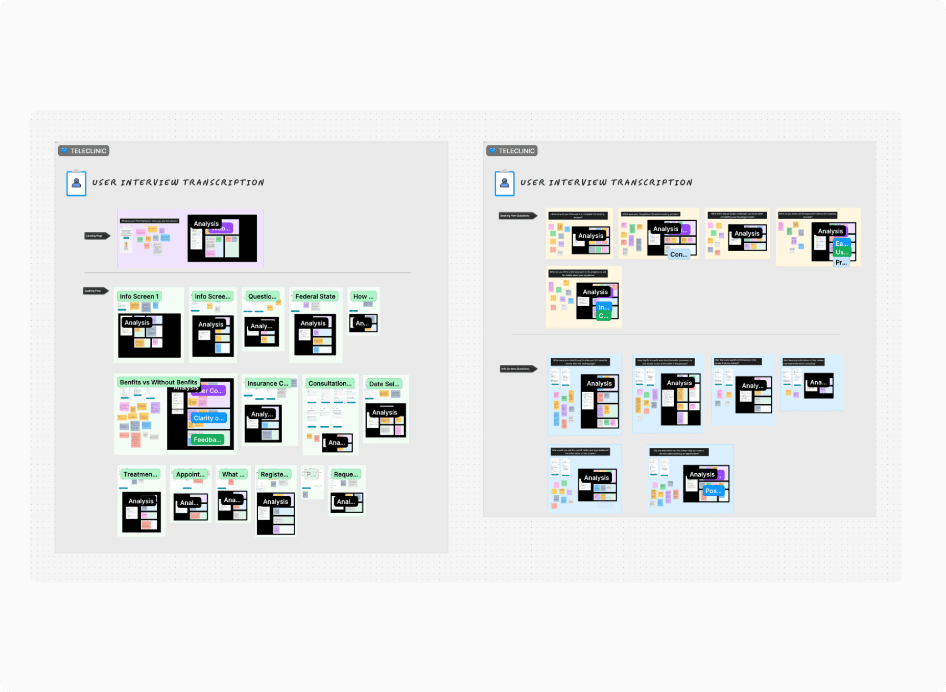
Conducted moderated usability testing and in-depth interviews with 9 new users (ages 28–38, based in Germany)
Participants were unfamiliar with TeleClinic but had exposure to similar telehealth tools — ideal for fresh impressions
Used a task-based booking scenario to evaluate the experience and observe in-the-moment friction
Structured interviews into three zones: Info Screen-specific questions, flow feedback, and broader impressions of the brand/website
Encouraged open feedback to surface both cognitive and emotional responses
Purpose:
Understand not just what users were doing, but why they were dropping off — through observed behaviours and emotional cues
Insight Synthesis & Direction
Activities:
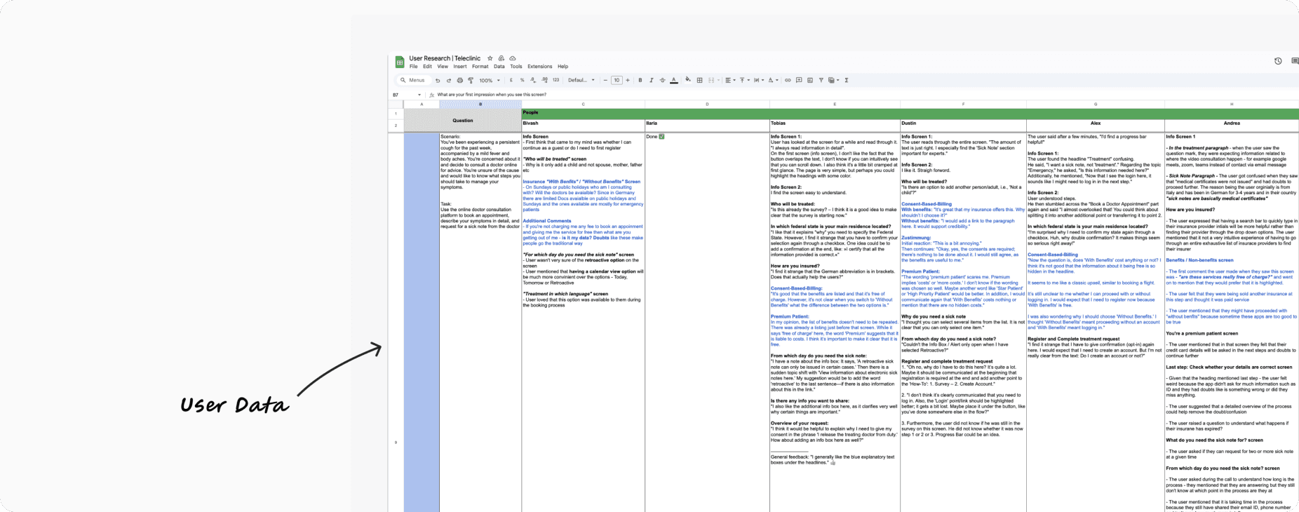
Transcribed and structured feedback along the user journey
Analysed interview data to extract themes and sub-themes based on real user quotes
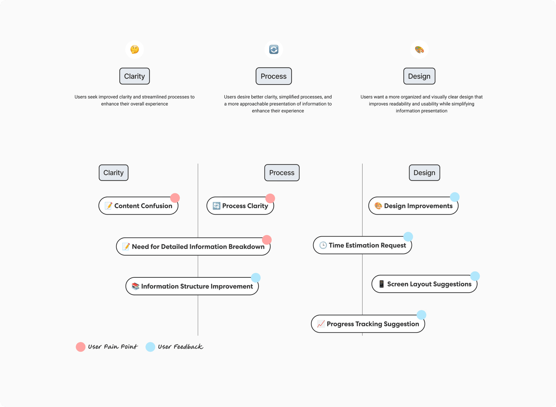
Identified 3 dominant friction themes: Clarity, Design Overload, and Process Ambiguity
Mapped each friction point to UX consequences and business outcomes (conversion, trust, retention)
Prioritised insights based on impact and frequency
Purpose:
Translate qualitative feedback into structured insight, link it to conversion risk, and guide design direction based on where intervention mattered most

Strategic Recommendations
We defined next steps around clarity-first redesign and lean experimentation:
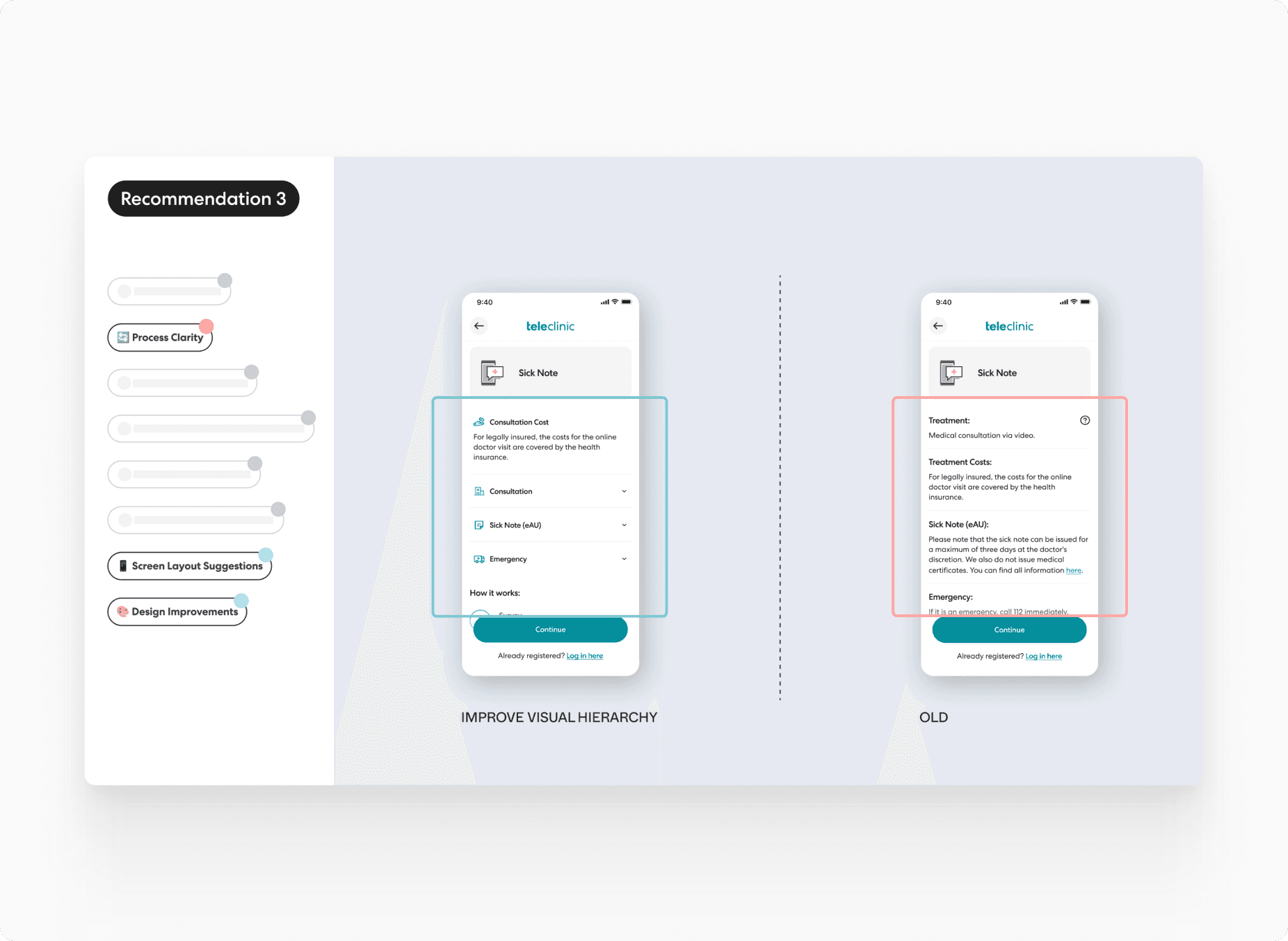
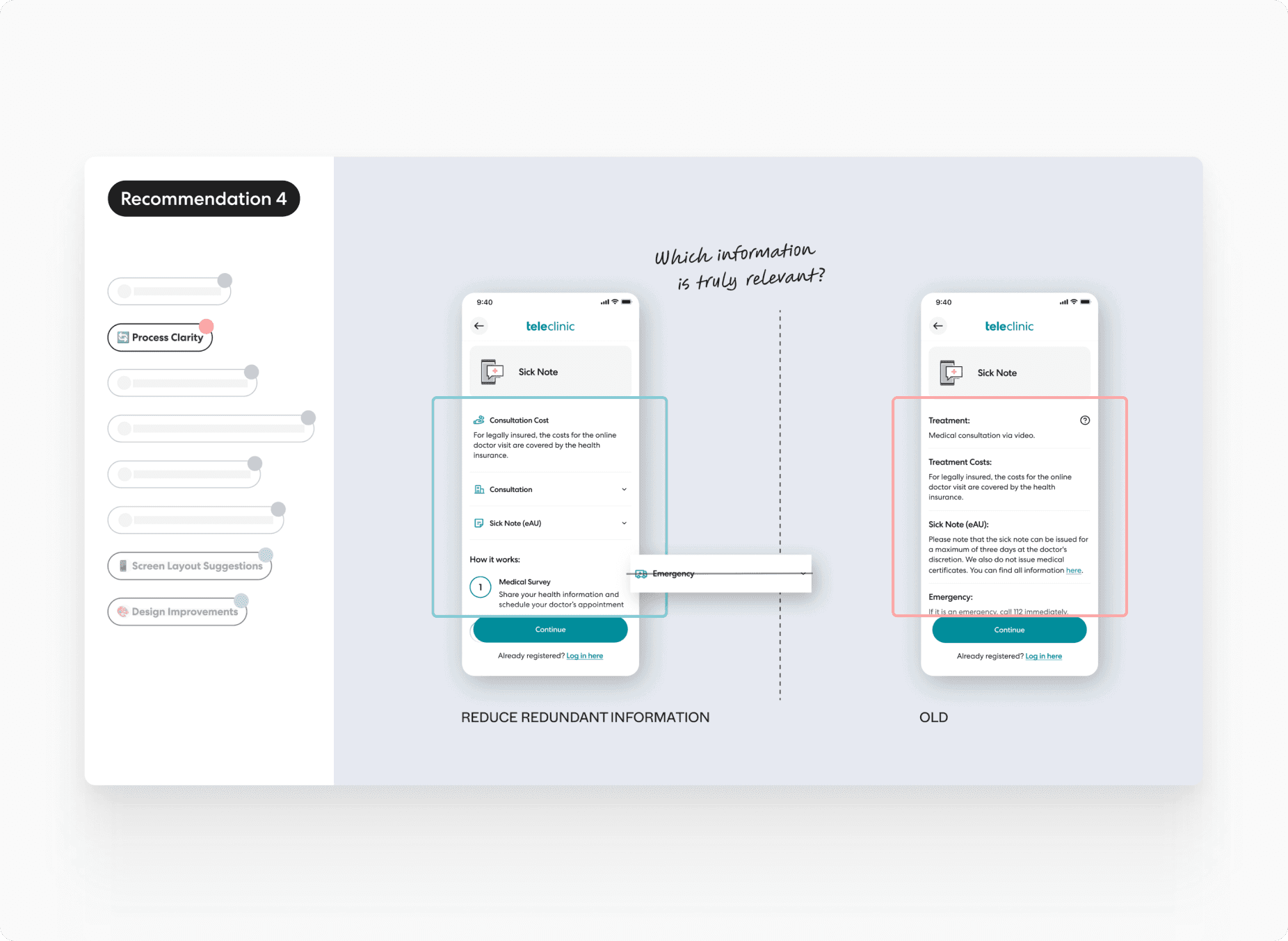
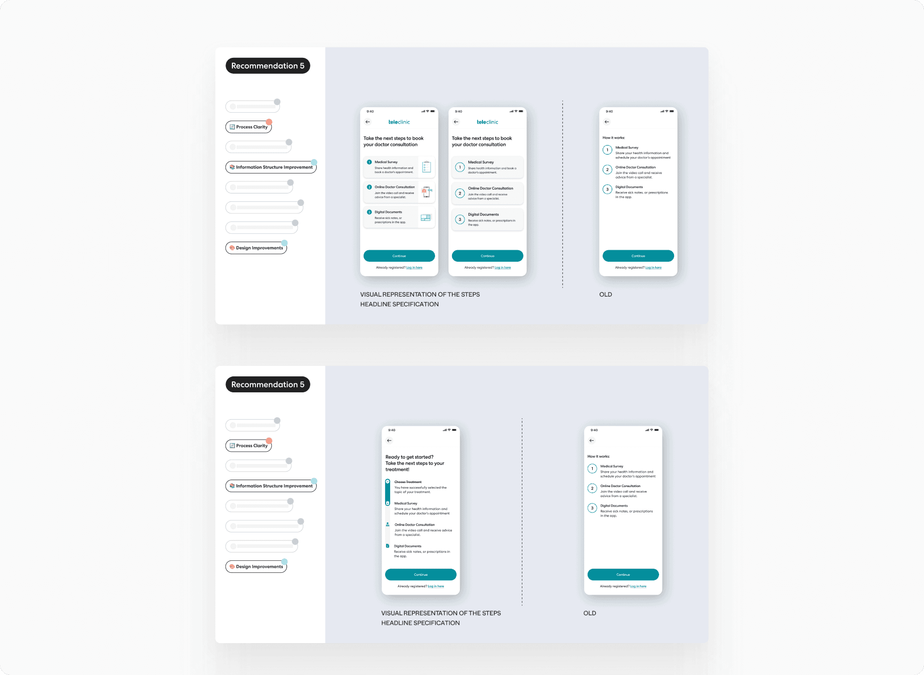
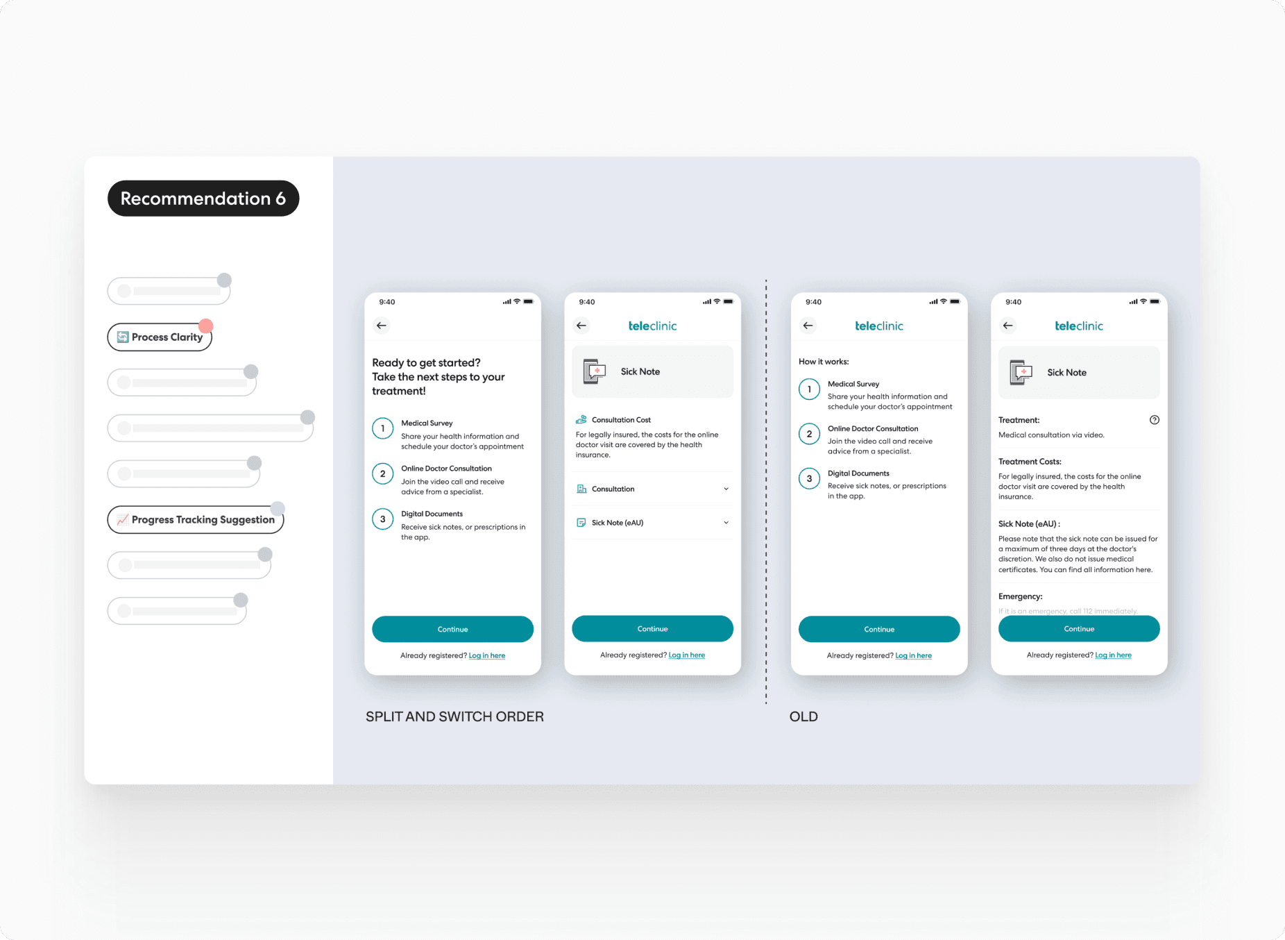
Redesign Info Screen for simplicity, guided disclosure, and microcopy improvements
Introduce trust cues early: doctor credentials, privacy reassurance, what happens next
Test smaller UI changes with controlled cohorts to measure impact
Prioritise clarity over completion speed to reduce bounce
All recommendations were tied back to specific insights gathered during moderated sessions and usability observation.


Handoff & Next Levers
Our research clarified the root causes of the 32% drop-off and helped reframe the problem as one of trust, clarity, and perceived effort — not just UI friction.The final recommendations offered a clear path forward:
– Simplify the Info Screen to reduce decision paralysis
– Reframe information architecture to improve flow understanding
– Use trust signals early to increase perceived safety
These were handed off to the TeleClinic product team as input for future experimentation and roadmap discussions.
TeleClinic
TeleClinic is a Germany-based digital healthcare platform that enables patients to access medical consultations online. It connects users with licensed doctors through secure video calls, allowing for fast, convenient, and compliant medical advice, prescriptions, and follow-ups — all without visiting a physical clinic.
As a leading telehealth provider in Germany, TeleClinic serves both insured and private patients, streamlining access to care across a range of medical concerns.
Team members on this project:
🧑🏻💻 Isabell Herzog - Senior Growth Product Designer
👨🏻💻 Neer - Product & Growth
Context
TeleClinic’s website acts as the primary entry point for new patients seeking online consultations. However, internal data revealed a 32% drop-off at the Info Screen stage — a critical point early in the booking flow.
This friction not only resulted in missed opportunities to convert high-intent users but also negatively impacted patient retention and care delivery.
Research Goals
Understand what's causing friction at the Info Screen step
Identify why high-intent users abandon early
Propose design and UX solutions to reduce drop-off and improve clarity
📌 Focus Segment: New users arriving via the website app who abandoned at the Info Screen
🎯 Primary Hypothesis: A combination of content clarity, design decisions, and process expectations could be contributing to the friction
Strategic Approach
We structured the work in 3 clear phases:
Phases | Focus |
|---|---|
Internal Alignment | Funnel analysis, stakeholder interviews, and data validation with the product team |
Mixed-Method Research | Usability tests, user interviews (9 participants, 28–38 y/o, Germany), flow analysis |
Insight Synthesis & Direction | Thematic analysis, mapping quotes to pain points, and consequence mapping |
💡 Initially planned segmentation for new vs. existing users was dropped due to technical feasibility. We focused exclusively on new users to stay within the timeline and scope.
Internal Alignment
Reviewed funnel analytics with the product team to identify drop-off points
Noted that ~50% of all users dropped off before completing the flow — with 44.23% of new users abandoning at the Info Screen
Observed that drop-offs were similar across both new and existing users — indicating systemic friction
Originally planned to run separate studies for new and existing users
Pivoted due to technical limitations (in-app survey complexity), and aligned on focusing solely on new users to stay within time and resource constraints
Purpose:
Build shared understanding of the problem space, align scope, and prioritise where to dig deeper first
Mixed-Method Research
Activities:
Conducted moderated usability testing and in-depth interviews with 9 new users (ages 28–38, based in Germany)
Participants were unfamiliar with TeleClinic but had exposure to similar telehealth tools — ideal for fresh impressions
Used a task-based booking scenario to evaluate the experience and observe in-the-moment friction
Structured interviews into three zones: Info Screen-specific questions, flow feedback, and broader impressions of the brand/website
Encouraged open feedback to surface both cognitive and emotional responses
Purpose:
Understand not just what users were doing, but why they were dropping off — through observed behaviours and emotional cues
Insight Synthesis & Direction
Activities:
Transcribed and structured feedback along the user journey
Analysed interview data to extract themes and sub-themes based on real user quotes
Identified 3 dominant friction themes: Clarity, Design Overload, and Process Ambiguity
Mapped each friction point to UX consequences and business outcomes (conversion, trust, retention)
Prioritised insights based on impact and frequency
Purpose:
Translate qualitative feedback into structured insight, link it to conversion risk, and guide design direction based on where intervention mattered most
Strategic Recommendations
We defined next steps around clarity-first redesign and lean experimentation:
Redesign Info Screen for simplicity, guided disclosure, and microcopy improvements
Introduce trust cues early: doctor credentials, privacy reassurance, what happens next
Test smaller UI changes with controlled cohorts to measure impact
Prioritise clarity over completion speed to reduce bounce
All recommendations were tied back to specific insights gathered during moderated sessions and usability observation.
Handoff & Next Levers
Our research clarified the root causes of the 32% drop-off and helped reframe the problem as one of trust, clarity, and perceived effort — not just UI friction.The final recommendations offered a clear path forward:
– Simplify the Info Screen to reduce decision paralysis
– Reframe information architecture to improve flow understanding
– Use trust signals early to increase perceived safety
These were handed off to the TeleClinic product team as input for future experimentation and roadmap discussions.